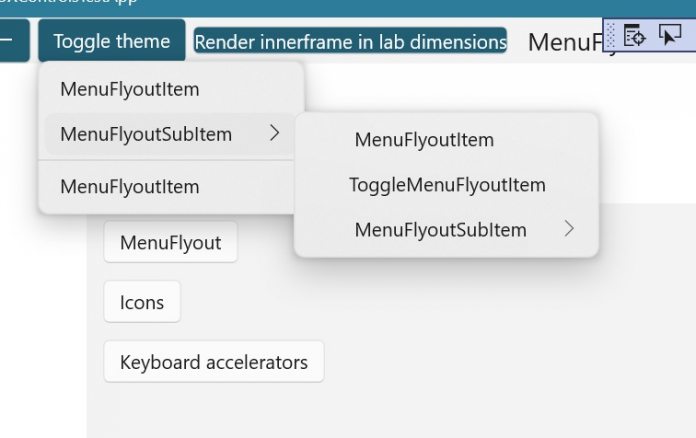
That means some UI elements that have rounded corners for context menus instead of Windows 10’s more squared corners. Microsoft has taken to GitHub to propose some of the design changes it has in mind. For example, rounded flyout menus for the TimePicker and DatePicker in Windows 10 Sun Valley apps. Microsoft is experimenting with a transparent-to-solid effect where the color solidifies when the flyouts set. In fact, in its proposal, Microsoft describes this as an “x-ray” effect: “This lets us do a color swap dynamically even during the scrolling, which gets a really smooth looking “x-ray” kind of effect.”
In a separate proposal on the Microsoft-owned GitHub, the company specifically mentions rounded corners for Windows 10 Sun Valley menus. If these tests reach the OS proper in the fall, it will mark a return to older design choice. Microsoft says the new rounded look will be present across Windows apps and settings menus. The company will add extra margins to menus to create more spacing between options. However, the accompanying images show that all Microsoft’s changes will retain the company’s Fluent Design.
Coming Soon
Looking ahead, it seems Microsoft’s rounded corners evolution will be wholesale on Windows 10. While the tests are for context menus, the company has plans to roll it out across apps. That means native Windows applications like Photos, Settings, and File Explorer will also get the new aesthetic. The next step for Microsoft is to transition these internal tests to users. That should happen in the coming month as Windows 10 Sun Valley previews take shape on the Windows Insider Program. If Microsoft moves ahead with the new design, public users will get rounded corners during the second half of this year. Tip of the day: Did you know you can use Windows 10´s built in antivirus Microsoft Defender also with scheduled scans? In our tutorial we give you step-by-step instructions on how to program your personal scan-schedule to keep your free of malware.


