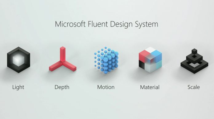
As Microsoft has already confirmed the existence of this UI, the company has revealed it fully today. Terry Myerson, Executive Vice President of Windows and Devices, wrote about Fluent Design in blog post. He says the UI will offer “intuitive, harmonious, responsive and inclusive cross-device experiences and interactions” for users. As this is Build, Microsoft is also showing what Fluent Design can do for developers. Specifically, the UI allows dev’s to offer more engaging experiences that will function intuitively across devices.
While Microsoft Fluent Design System will start life with the Fall Creators Update, it is more expansive. Indeed, only the first seeds of the UI will be planted in the upcoming feature upgrade. However, it will be developers and evolved over the coming years. In other words, the it will not be the finished article on Redstone 3.
Light and Elegant
Kevin Gallo, VP for Windows Developer Platform says the company focused on creating a UI that help developers create more engaging apps. Microsoft wanted a design language that was layered, offered depth and animations, but still looked elegant and light. This means a return to translucency, which was part of older Windows builds, but has been missing from recent iterations.


